In Cognos, You can create different charts for displaying the reports very similar to other report types like list and crosstab.
Following are the various chart types:
Column Charts
 Column charts are useful to compare discrete data or to show trends over time.
Column charts use vertical data markers to compare individual values.
This column chart uses actual values to show the revenue for each product line.
Pie Charts
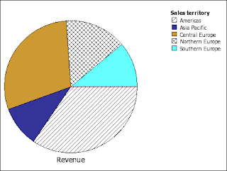 Pie charts are useful for highlighting proportions.
Pie charts use segments of a circle to show the relationship of parts to the whole. To highlight actual values, we recommend that you use another chart type, such as a stacked chart.
Pie charts plot a single data series. To avoid multiple pies when plotting multiple data series, we recommend that you use a 100% stacked chart.
Reports in PDF or HTML format are limited to show a maximum of 16 pie or gauge charts. If you need to see more, run the report in Excel Single Sheet format and they all appear in the report.
This pie chart shows that the largest proportion of revenue comes from the Americas, followed closely by the Central Europe region.
Pie charts can plot data using standard, 100%, and 3D configurations.
Progressive Column Charts
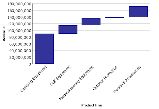 Progressive column charts are like stacked charts with each segment of a single stack displaced vertically from the next segment.
Progressive column charts are useful for emphasizing the contribution of the individual segments to the whole.
Progressive column charts are also known as waterfall charts. These charts are not supported for Microsoft Excel output.
This progressive column chart analyzes the contribution of each product line to revenue.
Progressive column charts can plot data using standard and 3D configurations. You can also create progressive charts using horizontal bars.
Bar Charts
 Bar charts are useful for showing trends over time and for charts that plot many data series.
Bar charts use horizontal data markers to compare individual values.
This bar chart shows actual revenue for every country.
Bar charts can plot data using standard, stacked, and 100% stacked configurations.
Line Charts
Line charts are useful for showing trends over time and for charts with many data series.
 Line charts plot data at regular points connected by lines.
We do not recommend that you use stacked line charts because they are difficult to distinguish from unstacked line charts using multiple data series.
This line chart shows a rising revenue trend in every territory.
Line charts can plot data using standard, stacked, 100% stacked, and 3D configurations.
Area Charts
Area charts are useful for emphasizing the magnitude of change over time. Stacked area charts are also used to show the relationship of parts to the whole.
 Area charts are like line charts that have the areas below the lines filled with colors or patterns.
We do not recommend that you use standard area charts in a chart that has multiple data series because it is possible for areas with lower values to be covered by others.
This stacked area chart shows the quantity of products sold over a two-year period in multiple territories.
Area charts can plot data using standard, stacked, 100% stacked, and 3D configurations.
Combination Charts
 Combination charts are useful for plotting multiple data series by using combinations of columns, areas, and lines.
This combination chart shows planned revenue as a column chart and actual revenue as an area chart.
Combination charts can plot data using standard, stacked, 100% stacked, and 3D configurations.
Radar Charts
 Radar charts are useful as a comparative tool and for charts with few data series.
Radar charts integrate multiple axes into a single radial figure. Data is plotted on each axis and joined to adjacent axes by connecting lines.This radar chart shows the revenue from multiple retailer types in multiple territories.
Radar charts can plot data using standard and stacked configurations.
Scatter Charts
 Scatter charts use data points to plot two measures anywhere along a scale, not only at regular tick marks.
Scatter charts are useful for exploring correlations between different sets of data.
This scatter chart shows the correlation between production cost and gross profit for each product line.
Bubble Charts
 Bubble charts use data points and bubbles to plot measures anywhere along a scale, like scatter charts. The size of the bubble represents a third measure.
Bubble charts are useful for visually representing financial data. These charts are not supported for Microsoft Excel output.
This bubble chart plots quantity and revenue by product line. The size of the bubble represents gross profit.
 Point Charts
Point charts are useful for showing quantitative data in an uncluttered fashion.
Point charts use multiple points to plot data along an ordinal axis. A point chart is similar to a line chart without the lines. Only the data points are shown.
This point chart shows the revenue for each product line.
Quadrant Charts
 Quadrant charts are useful for plotting data that contains three measures, using an x-axis, a y-axis, and a bubble size that represents the value of the third measure.
Quadrant charts are like bubble charts divided into four equal sections.
Use a quadrant chart to present data that can be categorized into quadrants, such as a SWOT (strengths, weaknesses, opportunities, and threats) analysis.
This quadrant chart shows the relationship between production cost and gross profit. The size of the bubble represents quantity.
Polar Charts
Polar charts are useful for showing scientific data.
 Polar charts are circular charts that use values and angles to show information as polar coordinates.
This polar chart shows the revenue and quantity for each product line. The distance along the radial axis represents revenue while the angle around the polar axis represents quantity.
Metrics Range Charts
 Metric range charts are useful for showing a target range and a tolerance range.
A metric range chart adds a target and range marker to a column, line, or area chart.
This metric range chart shows actual revenue versus planned revenue.
 Gauge Charts
Gauge charts are useful for comparing values between a small number of variables either by using multiple needles on the same gauge or by using multiple gauges.
Gauge charts use needles to show information as a reading on a dial. The value for each needle is easily read against the colored data range.
Reports in PDF or HTML format are limited to show a maximum of 16 pie or gauge charts. These charts are not supported for Microsoft Excel output.
This gauge chart shows the revenue and planned revenue for each sales territory.
Pareto Charts
Pareto charts are useful for prioritizing and focusing process changes.
 Pareto charts rank categories from the most frequent to the least frequent. It is more effective to act on the most frequent causes of events than to solve an easy yet infrequent issue.
You can create before and after comparisons of Pareto charts to show the impact of corrective actions. These charts are not supported for Microsoft Excel output.
This Pareto chart shows that the most frequent reason for product returns is unsatisfactory product.
You can also create Pareto charts using horizontal bars.
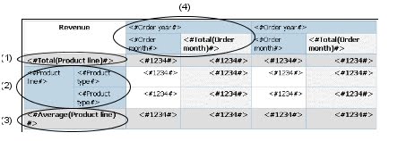
Chart Configurations
Chart configurations specify the grouping type of the columns, bars, lines, and areas in a chart. Some examples are standard, stacked, and 100% stacked charts.
Standard Charts
 Standard - or absolute - charts are useful for comparing specific values and for representing discrete data, such as different regions or individual employees. For example, a standard column chart that plots regional sales emphasizes the actual value that each region achieves in sales.
Standard charts plot the actual value of each data series from a common axis.
When you create charts using multiple data series, you can distinguish each series by the color or pattern of its data marker. Related data series are shown together in clusters for easy comparison.
In area and radar charts that have multiple data series, areas with lower values may be covered by others.
This clustered column chart shows the revenue values for each product line within each territory.
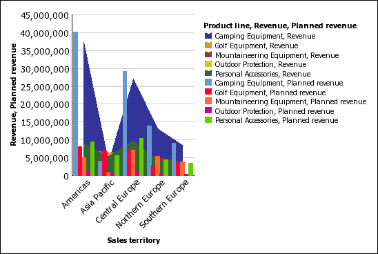
Stacked Charts
 Stacked charts are useful for comparing proportional contribution within a category. They plot the relative value that each data series contributes to the total. For example, a stacked column chart that plots product line sales will emphasize the proportion that each product line contributes to the total in each territory.
You can distinguish each data series by the color or pattern of its section in the stack. The top of each stack represents the accumulated totals for each category.
We recommend that you do not use the stacked configuration in line charts that have multiple data series because it is difficult to distinguish between standard and stacked configurations.
This stacked column chart shows the high proportion that camping equipment contributed to the actual revenue in most markets.
100% Stacked Charts
 100% stacked charts are useful for comparing proportional contribution across all categories. They plot the relative contribution of each data series to the total, expressed as a percentage. For example, a 100% stacked column chart that plots product line sales emphasizes the percentage within each region without referring to actual values.
You can distinguish each data series by the color or pattern of its section in the stack. Each stack represents 100 per cent.
100% stacked charts highlight proportions. When actual values are important, we recommend that you use another chart configuration.
This 100% stacked chart shows the percentage of sales for each product line in each region.
 3-D Charts
3-D charts are useful for creating charts with high visual content, such as graphics for use in presentations.
3-D column, bar, line, and area charts plot data by using three axes.
3-D pie charts have a three-dimensional visual effect.
We recommend that you do not use 3-D charts where there is a need to show exact values, such as for control or monitoring purposes. The distortion in 3-D charts can make them difficult to read accurately.
This 3-D chart shows actual revenue for each product line in each territory. Note the skipping of the labels on the x and y axes.
Following are the various chart types:
| Purpose | Chart type or configuration |
| Show contributions of parts to a whole | pie stacked configuration 100% stacked configuration |
| Show trends in time or contrast values across different categories | line area bar column |
| Compare groups of related information against actual values | standard configuration radar 3D |
| Compare different kinds of quantitative information | column-line |
Column Charts

Column charts use vertical data markers to compare individual values.
This column chart uses actual values to show the revenue for each product line.
Pie Charts
 Pie charts are useful for highlighting proportions.
Pie charts use segments of a circle to show the relationship of parts to the whole. To highlight actual values, we recommend that you use another chart type, such as a stacked chart.
Pie charts plot a single data series. To avoid multiple pies when plotting multiple data series, we recommend that you use a 100% stacked chart.
Reports in PDF or HTML format are limited to show a maximum of 16 pie or gauge charts. If you need to see more, run the report in Excel Single Sheet format and they all appear in the report.
This pie chart shows that the largest proportion of revenue comes from the Americas, followed closely by the Central Europe region.
Pie charts can plot data using standard, 100%, and 3D configurations.
Progressive Column Charts
 Progressive column charts are like stacked charts with each segment of a single stack displaced vertically from the next segment.
Progressive column charts are useful for emphasizing the contribution of the individual segments to the whole.
Progressive column charts are also known as waterfall charts. These charts are not supported for Microsoft Excel output.
This progressive column chart analyzes the contribution of each product line to revenue.
Progressive column charts can plot data using standard and 3D configurations. You can also create progressive charts using horizontal bars.
Bar Charts

Bar charts use horizontal data markers to compare individual values.
This bar chart shows actual revenue for every country.
Bar charts can plot data using standard, stacked, and 100% stacked configurations.
Line Charts
Line charts are useful for showing trends over time and for charts with many data series.

We do not recommend that you use stacked line charts because they are difficult to distinguish from unstacked line charts using multiple data series.
This line chart shows a rising revenue trend in every territory.
Line charts can plot data using standard, stacked, 100% stacked, and 3D configurations.
Area Charts
Area charts are useful for emphasizing the magnitude of change over time. Stacked area charts are also used to show the relationship of parts to the whole.

We do not recommend that you use standard area charts in a chart that has multiple data series because it is possible for areas with lower values to be covered by others.
This stacked area chart shows the quantity of products sold over a two-year period in multiple territories.
Area charts can plot data using standard, stacked, 100% stacked, and 3D configurations.
Combination Charts
This combination chart shows planned revenue as a column chart and actual revenue as an area chart.
Combination charts can plot data using standard, stacked, 100% stacked, and 3D configurations.
Radar Charts

Radar charts integrate multiple axes into a single radial figure. Data is plotted on each axis and joined to adjacent axes by connecting lines.This radar chart shows the revenue from multiple retailer types in multiple territories.
Radar charts can plot data using standard and stacked configurations.
Scatter Charts

Scatter charts are useful for exploring correlations between different sets of data.
This scatter chart shows the correlation between production cost and gross profit for each product line.
Bubble Charts

Bubble charts are useful for visually representing financial data. These charts are not supported for Microsoft Excel output.
This bubble chart plots quantity and revenue by product line. The size of the bubble represents gross profit.

Point charts are useful for showing quantitative data in an uncluttered fashion.
Point charts use multiple points to plot data along an ordinal axis. A point chart is similar to a line chart without the lines. Only the data points are shown.
This point chart shows the revenue for each product line.
Quadrant Charts

Quadrant charts are like bubble charts divided into four equal sections.
Use a quadrant chart to present data that can be categorized into quadrants, such as a SWOT (strengths, weaknesses, opportunities, and threats) analysis.
This quadrant chart shows the relationship between production cost and gross profit. The size of the bubble represents quantity.
Polar Charts
Polar charts are useful for showing scientific data.

This polar chart shows the revenue and quantity for each product line. The distance along the radial axis represents revenue while the angle around the polar axis represents quantity.
Metrics Range Charts

A metric range chart adds a target and range marker to a column, line, or area chart.
This metric range chart shows actual revenue versus planned revenue.

Gauge charts are useful for comparing values between a small number of variables either by using multiple needles on the same gauge or by using multiple gauges.
Gauge charts use needles to show information as a reading on a dial. The value for each needle is easily read against the colored data range.
Reports in PDF or HTML format are limited to show a maximum of 16 pie or gauge charts. These charts are not supported for Microsoft Excel output.
This gauge chart shows the revenue and planned revenue for each sales territory.
Pareto Charts
Pareto charts are useful for prioritizing and focusing process changes.

You can create before and after comparisons of Pareto charts to show the impact of corrective actions. These charts are not supported for Microsoft Excel output.
This Pareto chart shows that the most frequent reason for product returns is unsatisfactory product.
You can also create Pareto charts using horizontal bars.
Chart Configurations
Chart configurations specify the grouping type of the columns, bars, lines, and areas in a chart. Some examples are standard, stacked, and 100% stacked charts.
Standard Charts

Standard charts plot the actual value of each data series from a common axis.
When you create charts using multiple data series, you can distinguish each series by the color or pattern of its data marker. Related data series are shown together in clusters for easy comparison.
In area and radar charts that have multiple data series, areas with lower values may be covered by others.
This clustered column chart shows the revenue values for each product line within each territory.
Stacked Charts

You can distinguish each data series by the color or pattern of its section in the stack. The top of each stack represents the accumulated totals for each category.
We recommend that you do not use the stacked configuration in line charts that have multiple data series because it is difficult to distinguish between standard and stacked configurations.
This stacked column chart shows the high proportion that camping equipment contributed to the actual revenue in most markets.
100% Stacked Charts

You can distinguish each data series by the color or pattern of its section in the stack. Each stack represents 100 per cent.
100% stacked charts highlight proportions. When actual values are important, we recommend that you use another chart configuration.
This 100% stacked chart shows the percentage of sales for each product line in each region.

3-D charts are useful for creating charts with high visual content, such as graphics for use in presentations.
3-D column, bar, line, and area charts plot data by using three axes.
3-D pie charts have a three-dimensional visual effect.
We recommend that you do not use 3-D charts where there is a need to show exact values, such as for control or monitoring purposes. The distortion in 3-D charts can make them difficult to read accurately.
This 3-D chart shows actual revenue for each product line in each territory. Note the skipping of the labels on the x and y axes.